Art Guidelines
Submitting your artwork.
List of Art Requirements
and Guidelines
Requirements by Print Method
Software and/or File Format
Vector vs. Raster
Methods for Submitting Artwork
Cut Margin and Bleed
Font/Text
Alphanumeric Numbering, Variable Data, and Barcodes
White Ink on Clear Materials
Sticker Sheet Specifications
Pro-Cut Guidelines
Contrasting Colors
Download Art Templates
Requirements by
Print Method
Spot and 4-Color Process Printing
Spot Color:
-
-
- All spot color jobs require vector artwork.
- If raster artwork is the only art available, contact your customer success representative.
-
4-Color Process:
-
-
- Vector artwork is preferred.
- Raster artwork is only acceptable for photographs and similar style artwork.
- If raster artwork is the only art available, 600 dpi at 100% size is required for best results.
-
Software/File Format
Preferred: (Creative Cloud)
-
-
- Illustrator .ai
- InDesign .indd (Include fonts and links)
- Photoshop .psd (.psd is raster artwork)
-
Supported:
-
-
- .tif (if raster is acceptable, see below)
- .pdf (fonts must be converted)
-
Vector vs. Raster
Vector
Vector artwork is an image created of points and paths. This results in artwork that is editable, scalable, and able to be separated for spot color reproduction.
Common Vector file formats include: .ai, .fh(x), .cdrm, and .indd (these formats may also contain raster artwork).
Raster
Raster artwork is an image created of many pixels. This results in artwork that is not editable, scalable, or able to be separated for spot color reproduction.
Common Raster file formats include: .jpg, .bmp, .psd, .tif, and .pcx.
Vector Artwork Guidelines:
Follow these guidelines to avoid additional charges and/or time for your order.
-
-
- Artwork must be submitted at the actual size of the finished product.
- All fonts must be converted to outlines/paths.
- All placed/linked images must be embedded or included separately.
- All images must include the required bleed if necessary.
- A color copy or .jpg indicating cut should be submitted for reference.
- All spot colors should be specifically identified. Include white if necessary.
- Cut/Die line should always be clearly indicated with an unused spot color.
-
Download Art Templates for your products to ensure your vector artwork is correct. Download Templates
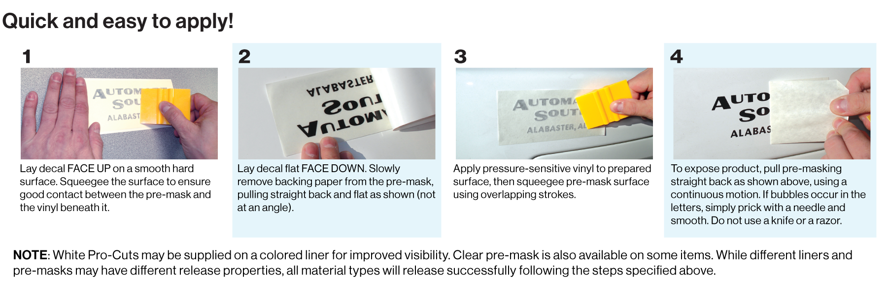
Submitting Artwork
Preferred: Email or Website (contact customer service for details), CD‑R/RW
1. Include a .jpg, .png, or .pdf for reference
2. Convert all fonts to paths/outlines
3. Include or embed all placed images
4. Submit artwork at actual size
5. Identify all spot colors
6. Allow for bleed if necessary
7. Submit the original file if possible
8. Never flatten/merge the layers of a .psd
9. Indicate the cut/die line clearly
10. Verify art meets all Artwork Guidelines
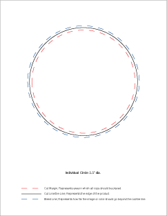
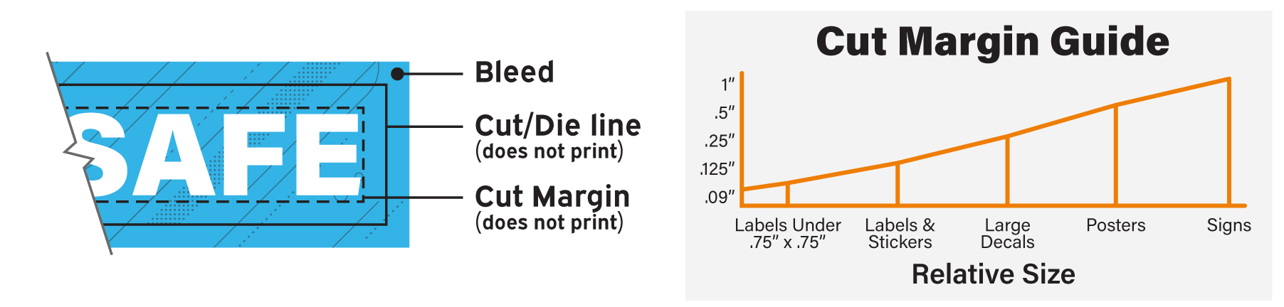
Cut Margin and Bleed
Bleed
Bleed is the distance the ink extends past the finished edge of the product before final cutting. Standard minimum bleed is 1/8″ (.125″). Raster files must allow for the required bleed when submitted because they are not editable like vector files.
Cut Margin
Cut margin is the minimum space required between elements of art and the finished edge of the product. Size and product are the two main factors that determine cut margin.
Note that bleed borders must exceed our minimum cut margin.
Font/Text Guidelines
Available Fonts:
Adobe Font Folio 9.0
(Contact our customer success team for details.)
Minimum Font Sizes:
San Serif in All Caps
Positive: 4 pt. bold / Reverse: 6 pt. bold
Serif in All Caps
Positive: 6-8 pt. bold / Reverse: 10-12 pt. bold
Live Text:
Live text is still in a text format in the artwork’s original program and can still be spell checked and corrected. Live text does require the fonts used in order to be displayed and printed correctly.
Converted Text (Outlines/Paths/Curves):
Converted Text is vector artwork and as such can no longer be spell checked. However, it does not require fonts in order to be displayed or printed correctly.
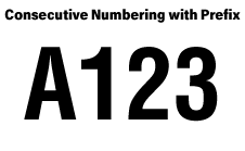
Alphanumeric Numbering, Variable Data, and Barcodes
Available in Black only. May require an Excel spreadsheet.
Alphanumeric Numbering: Black numbering is available with letters for use as prefixes and suffixes. Example: “A123”, “123 RED LOT”
Variable Data: Variable data is available for copy such as phone numbers and locations.
Submit an Excel spreadsheet containing the data.

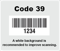
Barcoding: Barcodes are available as constant, variable, or consecutive, in Code 39. Barcodes with variable numbers will require an Excel spreadsheet. Chrome and reflective materials will interfere with code readers. White is required behind barcodes and QR codes.
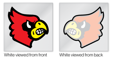
White Ink on Clear Materials
Clear materials often require white ink to maintain color integrity. Three options are typically used depending on the art and text elements.
1. Flooding the Background White
Flooding coats the entire decal with white and, except on rare occasions, it should be done with face application clear decals only.

2. Applying a White Halo
Elements with a halo are backed for opacity and have white extending slightly beyond the art creating a “halo” effect. It is best used to increase contrast against dark backgrounds.

3. Backing Up Elements or Text
If the text or elements are thick enough, the white can be printed behind the text or elements only. White adding opacity, white would be unseen from the front of the decal.
Sticker Sheet Specifications
Please follow these guidelines when setting up your art to ensure your custom sticker sheets print and kiss-cut successfully:
-
-
-
- Edge Bleed (Sheet): Extend your artwork at least 3/32″ (.09375″) past the outside finished edge of the full sheet.
- Cut Margin (Edge Spacing): Keep at least 1/8” (.125”) of space between the edge of your sheet and any sticker cut lines.
- Space Between Kiss Cut Shapes: Maintain at least 3/16″ (.1875″) of space between each internal sticker edge or kiss-cut shape.
- Bleed Around Each Design (if desired): Allow 3/32″ (.09375″) of bleed outside each kiss-cut sticker shape.
- Cut Margin per Kiss Cut Shape: Leave an 1/8″ (.125″) inner margin from the edge of the kiss-cut to the beginning of key elements of sticker art.
- Corner Styling: Round both outer and inner kiss-cut points for a clean finish that’s easy to separate and prevents stickers from peeling prematurely.
- Die Line: Clearly indicate cut or die line with an unused spot color.
-
-
Pro-Cut Guidelines
-
-
- Simple and open typestyles are recommended.
- All text must be at least 1/4″ (.25″) tall.
- The space between characters and elements must be at least 1/16″ (.167″).
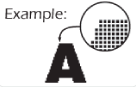
- Main strokes, line weights, or art elements should be a minimum of 1/16″ (.167″).
- Pro-Cuts should be measured according to the active material area being used.
- An additional carrier for the material will be applied automatically for the process.
- Proofs are frequently required for this product.
-
Additional info for Domed Pro-Cut Decals:
-
-
- Main strokes, line weights, or art elements should be a minimum of 5/32” (.15625″).
- Round all corners and edges to 5/64” (.078125″).
-

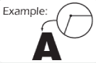
Picks are the areas of the letters or graphics that must be pulled out after cutting. Additional costs are applied to orders over 14 picks per decal.
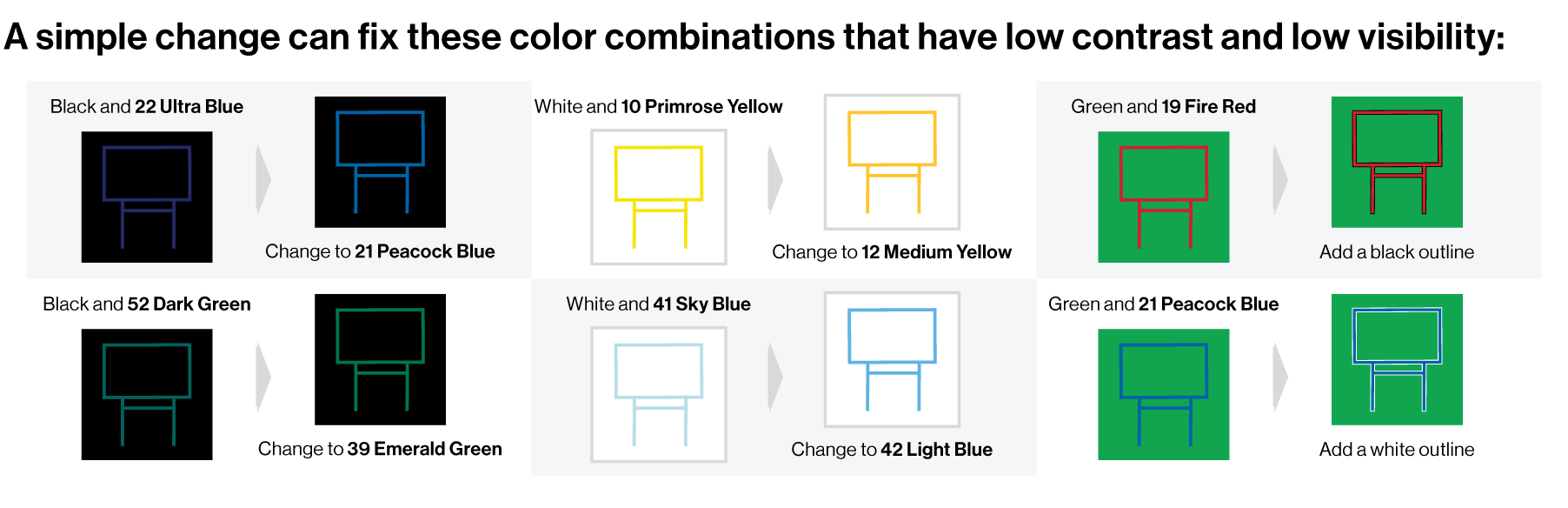
Contrasting Colors
When selecting colors for use in a layout remember that visibility is key. Often color combinations can hinder visibility due to a lack of contrast. Below are some examples of low contrast color combinations and our recommendations for better visibility.
Download Art Templates
Downloadable art templates are at 100% size in both EPS and PDF file formats. They reference final print size, minimum bleeds, and cut margins to assist you in laying out your artwork.

We’ll take care of your print order and you, ensuring you get what you want and what you need.