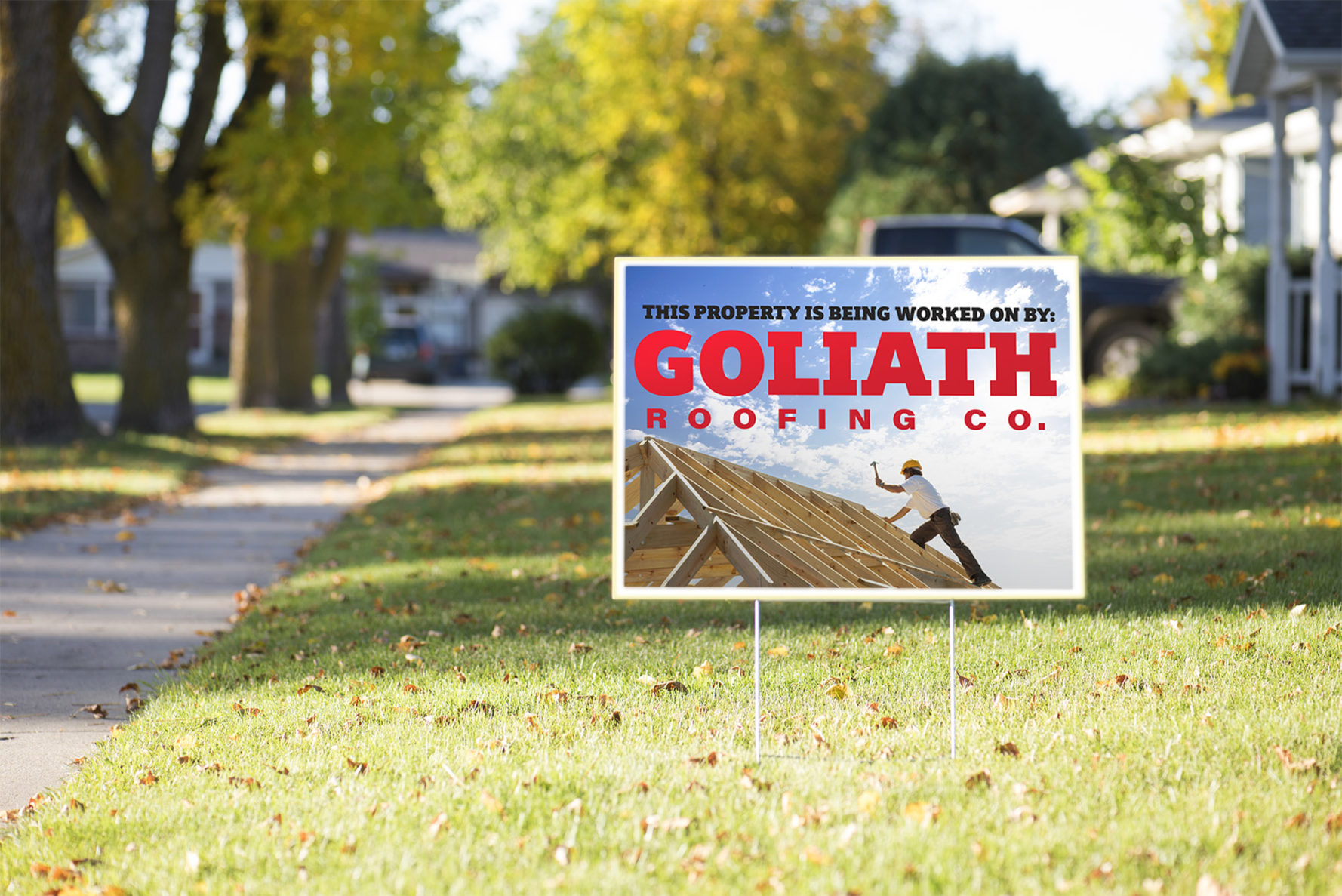
Letter Height for Signs
There are many factors to weigh when deciding on a letter height on signage.
The rule of thumb on our chart is 30. Letters are legible from 30 feet per inch of height. This guideline applies to indoor signs or smaller copy on the artwork. As you see on our chart, we list a distance for maximum impact. That column will be referenced for headlines, names or anything you want to emphasize.
Factors that will interfere with readability:
- Thickness of letters
Thinner letters will be harder to read. Choose a simple bold font that will help grab attention. Test out fonts in your office by printing out a word or two and taping it up on the wall. - White Space
White space is the open area around the copy. We recommend using the 40/60 rule. Generally, copy should take up 40% of the sign, and 60% should be white space. This will allow your words to “breathe” and be more readable. White space will help the words create a contrast with the background and stand out to the reader. - Kerning
Kerning is the space between the letters. This will go hand in hand with white space. Spacing your letters too closely will make the copy very hard to read. Don’t make the mistake of having extremely large letters, extremely close together; this will heavily reduce the readability of the copy. - Color and Contrast
Having a high contrast in colors on signage that will be viewed from a distance is very important. Be sure to test out your color combinations. Artwork that looks good on a website or magazine may not hold up on an outdoor sign.
If you plan on placing your signage along a road, you need to do some research regarding the free flow of traffic in the area. Look into the speed limit, number of lanes, how busy the road is and if the sign will be near a stoplight or stop sign. The copy needs to be large enough to read in the few seconds you have the viewer’s attention.
Test this by timing how long it will take to read the message on the sign. Factor in the speed of the car and determine how large the copy needs to be to give the viewer enough time to read the sign.
Don’t miss another post! Sign up for our blog.
Blog Sign-Up
Sign up for our blog

